


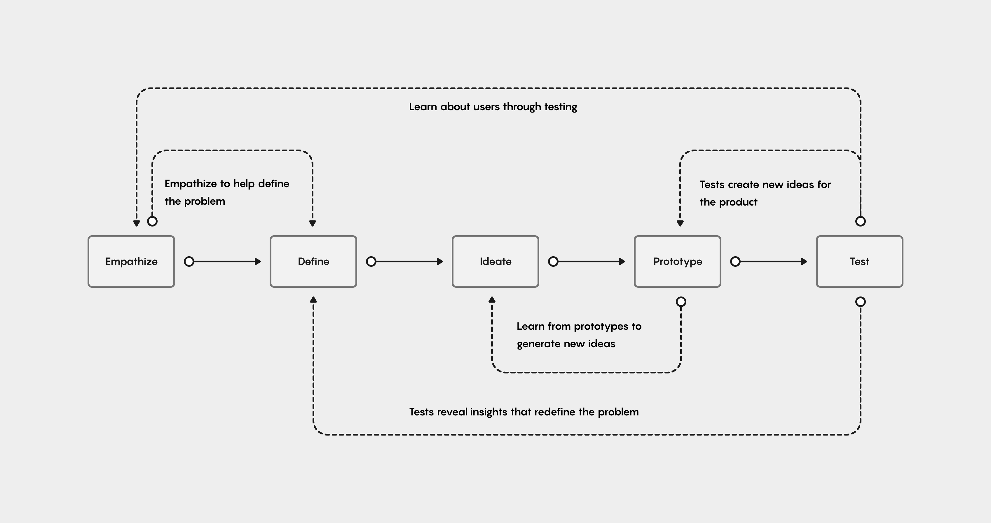

I start off every design project with a practical research canvas to establish a clear purpose, set clear goals and measures of evaluation, to help define the problem space, to clearly identify my initial assumptions, to lay-out my hard deliverables, and to choose the appropriate research methods.


For the initial research on RSL Workflows, I led recruiting, planning, facilitation, and synthesis, making use of several different methods.
-I leveraged a benchmarking usability test of the existing MVP to understand the current usability issues, and establish a basis of comparison for all subsequent iterations. To help with initial alignment between design and the business and product teams, I leveraged and tested, the two core product metrics I mentioned earlier, onboarding time, and 'creation to publishing conversions'; alongside traditional usability metrics like time on task, task completion rate, and error rate.
-I used contextual inquiries and user interviews to help contextualize the 'why' and 'how' behind the usability issues, and to uncover additional user pain points.
-I led interviews with internal stakeholders to understand and align on the business objectives and product metrics.
-I also conducted shadowing sessions of customer support calls that highlighted user pain points.
Finally, I synthesized all the research data to look for common patterns and themes across the user journey.

For this case, I am going showcase the design through the Lens of Anna, an HR Benefits Administrator in a large Enterprise organization with over 15,000 employees.
Anna manages and administers her organization's retirement plans, health benefits, life insurance, and supplemental benefits.
She's looking for an easy to use, automated, low-code solution that she can operate on her own, without relying on Engineers and multiple applications.

To set the stage for the case study, here's a quick 5-step overview of how the users worked through the existing MVP.
When working with new products, expectations are often disparate to reality. My initial research highlighted the stark difference between how we thought users were using the Workflows product, and how the users were actually using it.

Initial Assumption & Expectation: As Anna progresses through the Workflows experience, she is thinking about her PDF first, since that is what she already has. She will move linearly through a stepped builder, never needing to go backward.

Validated Reality: Anna is thinking, first, about what her user will input and her PDF is a secondary thought; but, because the two are so deeply linked, she toggles back and forth between the steps of the builder to ensure what she has set up reflects properly on both artifacts.
As I stated ideating, I focused on thinking about how I could move the validated reality towards the ideal expectation by mapping out the user's core pain points, and turning them into opportunities to solve problems through my design process.

Back to our Benefit Admin user, Anna. Her mental model is supported by a single editing state that allows for side-by-side referencing of both the webform and PDF. All features are discoverable and cater to her iterative process. This new mental model set the stage to kick-off my iterative design process.

Based on research insights, it was clear this redesign was not a matter of defining user tasks; It was a question of how to fit the existing pieces of the Workflow editor together, to better complete those tasks.
To kick off my ideation phase, I sketched out a parts list with a few general concepts for each.


Very quickly, the idea of a side-by-side webform and PDF view became a clear vehicle for communicating that the two artifacts (webforms and PDFs) are inextricably linked. From there, it was a matter of moving the rest of the pieces to fit into this new navigation structure.


Because there are multiple layers of relationships and editing states to communicate, finding a navigation hierarchy that could turn this idea from concept to functional prototype took several stabs.
The guiding principle became reinforcing the ability to see both the webform and PDF together in one view. From there it was a matter of layering in the other nvaigation needs.
The winner, based on user testing, was to keep the focus on one side-by-side step, with a clear CTA. Futher iteraations would be made to add emphasis to the secondary pagination, per user feedback.

Here's an early mid-fi iteration of the side-by-side concept. It relied heavily on interaction, movement, and progressive disclosure to reinforce the ideas that these two artifacts, each requiring editing, are different sides of the same coin. The design uses materiality to define editable areas.
By exploring highlighting, transitions, and foreshadowing in prototypes, it be came possible to test with users, and communicate with engineering, what the vision for this new experience would be.

The most successful navigation interaction was a sliding tab to keep users oriented in the space, as it moves. Here's an early prototype I tested with users, to validate the final direction.

Highlighting the related selections from one half to the other is just one layer of interaction reinforcing their connection. Users wanted even more.

The ability to preview a build needed more differentiation from the rest of the editing capabilities, in order to demonstrate that the user is in a new state in which they can see a real time preview. The hover interaction and tooltips reinforce this context.

The issue with Workflow settings, in the past, had been that they were scattered about the tool before, during, and after building the actual workflow.
Common cases of users needing professional services help, were to locate and understand these settings options; which even internal users had a tough time keeping track of.
Simplifying and consolidating settings, based on current user behavior, and bringing them all into a single step in the workflow editing experience, brings discoverability to these powerful and useful tools.
Here are a few additional user pain points I addressed, as I began the final design refinements. The additional refinements were based on a one week study, with 5 participants, testing two iterations of prototypes.
This study helped catalyze these final refinements and concepts into viable, validated, engineering ready design.
The primary takeaway from the final round of testing was: the overall hierarchy and structure were good, but there were missing layers of additional information, communication, and streamlining that were needed to make this a productive standalone tool.


One of the most complicated pieces of this project was breaking it up into a roadmap. As a project that refactored dozens of already existing features, it took over 2,000 Figma spec frames to detail-out all the changes it would take to fully address all the pain points in the current tool.
That amount of work was never going to be done in one launch. It took a critical eye, and both product and engineering input, to formulate a plan that would bring a new MVP to market in 5 months. The guiding light became keeping par with the current toolset and deprioritizing anything net new.

Now, with the new Workflows experience, Anna, the Benefits Administrator, can turn her complex PDF into a simple online workflow without hours of support from professional services personnel.

Anna is guided through the Workflow builder, setting her up for success with a complete first time user experience, tutorials, and an entirely new help center to orient and guide her on her way.

Anna can focus on her user's/employee's experience. When she uploads a complex PDF, she sees a webform has already been generated based off of her document. (Which is her primary concern since this is what her users/employees will interact with.)

Anna understands the connection between the webform and PDF, instantly. She toggles back and forth, seamlessly, between the Webform and PDF to edit both, understanding all-the-while how the two are connected.

Anna understands what work she has already done, and what needs her attention. She can tell, at a glance, what pieces are missing or unconnected, helping her problem-solve and complete her Workflow in one-go.

Anna has full control over her workflow's settings, before publishing it.
Once she is confident with her workflow, she continues to the settings page to see all of the possibilities available to her, in one place.
In a fraction of the time and clicks, Anna is able to build a Workflow from scratch, and begin collecting information from her users/employees, with the confidence that their experience will be up to her standard, and the data they provide will properly populate her original PDF.
I design products & experiences that create outcomes & influence user behavior.


